
Bitkatapult Mobile-friendly Responsive Navigation Menu WordPress Plugin
Changes your list-style navigation to a mobile-friendly, responsive dropdown navigation which is small if not in use and fixed to top.
The Bitkatapult Mobile-friendly Responsive Navigation Menu changes your standard list-style navigation to a mobile-friendly one. You can set many things to make the navigation fitting your site-design and to modify the function of this plugin. If you wish, set it to position the menu fixed at the top of the screen, or attach the menu to a css-selector of your coice. You can set expand-symbols, as the behaviour of the collapse/expand mechanism. You can set the colors of backgrounds without modifying you css files. the other colors are leaned on your site design. If you find this plugin helpful to you, please feel free to spend me a cup of coffee :)
dropdown
fixed
menu
mobile
navigation
responsive


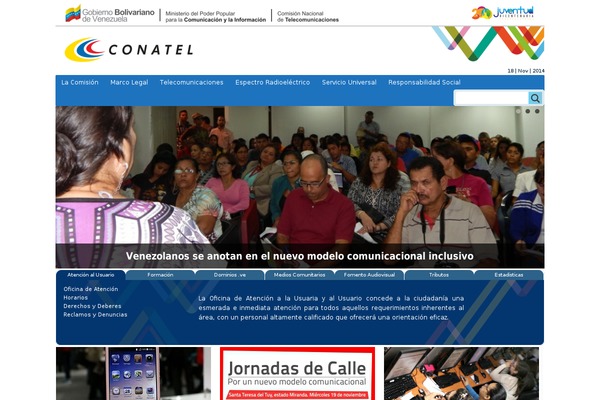
Sites running Bitkatapult Mobile-friendly Responsive Navigation Menu, click to open one
Plugins with a similar footprint
Ranked by how many sites run them — a quick way to compare alternatives.


Usage of Bitkatapult Mobile-friendly Responsive Navigation Menu over time
June 2023 — July 2024Between June 2023 and July 2024 the number of sites running this plugin went from 4 to 4 — up 0 (+0%).
| Month | Sites | Change |
|---|---|---|
| July 2024 | 4 | +0 |
| June 2024 | 4 | +0 |
| May 2024 | 4 | +0 |
| April 2024 | 4 | +0 |
| March 2024 | 4 | +1 |
| February 2024 | 3 | +0 |
| January 2024 | 3 | +0 |
| December 2023 | 3 | +0 |
| November 2023 | 3 | +0 |
| October 2023 | 3 | -1 |
| September 2023 | 4 | +0 |
| August 2023 | 4 | +0 |
| July 2023 | 4 | +0 |
| June 2023 | 4 | — |
Sites running Bitkatapult Mobile-friendly Responsive Navigation Menu
All sites in the collection4 examples from the collection. Open any site to see the theme and plugins we found on it.