WP Mobile Menu WordPress Plugin
Transform your website with a user friendly, dedicated and responsive mobile menu.
WP Mobile Menu is a WordPress Plugin that allows you to have a specific Responsive Header and Footer Bars with several Menus that will only appear at a specific resolution determined by you. This way you can build extra menus when your website visitors access through Mobile Devices.
The Menu Panels have Widgetized areas, this way you can add your own content above and bellow the Worpdress Menus.
Check the demo at: http://mobilemenu.jedipress.com/ You must resize your browser window to a lower resolution to see the plugin in action.
addition
hide
menu
mobile
responsive
show
slide
theme
widget
woocommerce
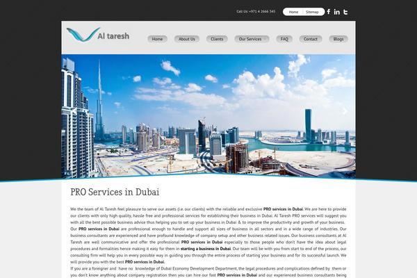


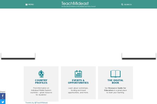
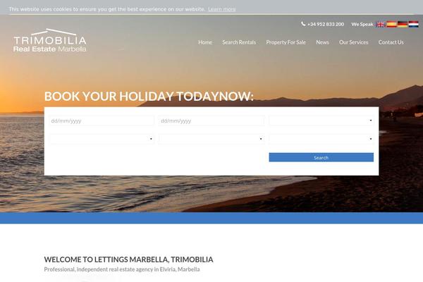
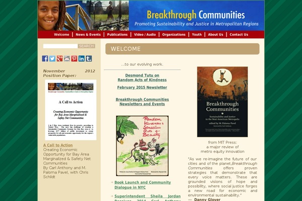
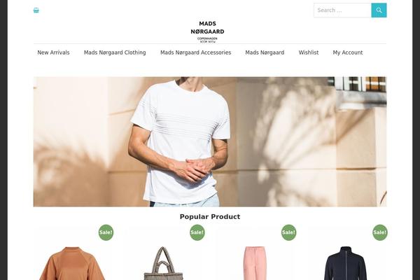
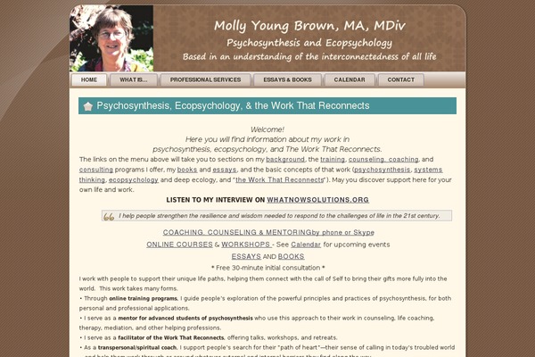
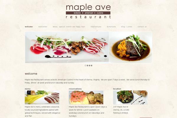
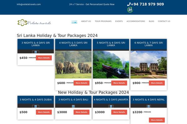
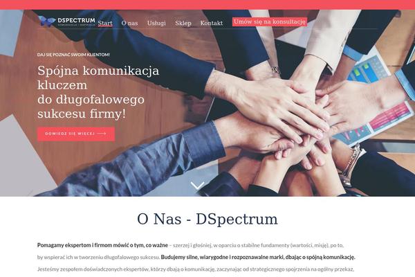
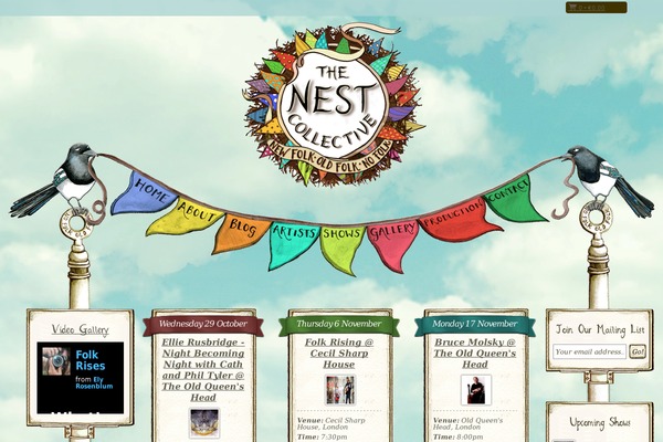
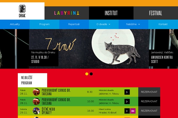
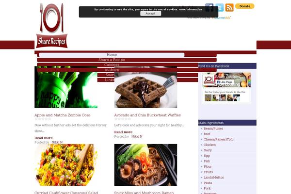
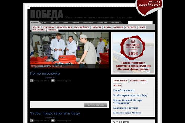
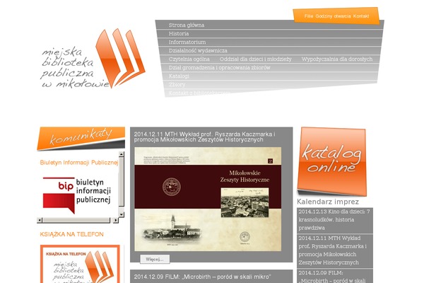
Sites running WP Mobile Menu, click to open one
Plugins with a similar footprint
Ranked by how many sites run them — a quick way to compare alternatives.


Usage of WP Mobile Menu over time
June 2023 — July 2024Between June 2023 and July 2024 the number of sites running this plugin went from 603 to 2 134 — up 1 531 (+253.9%).
| Month | Sites | Change |
|---|---|---|
| July 2024 | 2 134 | +75 |
| June 2024 | 2 059 | +147 |
| May 2024 | 1 912 | +89 |
| April 2024 | 1 823 | +134 |
| March 2024 | 1 689 | +168 |
| February 2024 | 1 521 | +75 |
| January 2024 | 1 446 | +210 |
| December 2023 | 1 236 | +235 |
| November 2023 | 1 001 | +88 |
| October 2023 | 913 | +68 |
| September 2023 | 845 | +169 |
| August 2023 | 676 | +34 |
| July 2023 | 642 | +39 |
| June 2023 | 603 | — |
Themes used with WP Mobile Menu
Detected most often on sites that run this plugin.
| # | Theme |
|---|---|
| 1 | Divi |
| 2 | Genesis |
| 3 | Twentytwelve |
| 4 | Divi-child |
| 5 | Canvas |
| 6 | Bones |
| 7 | Avada |
| 8 | Astra |
| 9 | X |
| 10 | Bb-theme |
| 11 | Generatepress |
| 12 | Cherryframework |
| 13 | Bb-theme-child |
| 14 | X-child |
| 15 | Twentyten |
| 16 | Storefront |
| 17 | Twentytwelve-child |
| 18 | Vantage |
| 19 | Twentyeleven |
| 20 | Bridge |
Sites running WP Mobile Menu
All sites in the collection100 examples from the collection. Open any site to see the theme and plugins we found on it.